The Sign, Part I
Hello World. After a long period of gestation, the sign is ALIVE.

The Count.It sign is ALIVE.
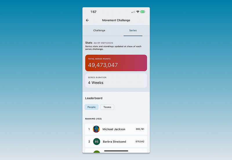
For those just tuning in, Count.It is in the business of fitness-tracker driven activity challenges, and our primary “game mechanic” to date has been the leaderboard:

Leaderboards are cool, but have limitations. Not everyone is a fan of overt, hierarchical competition. Also, the motivation of a leaderboard falls off very quickly once you get outside the top ten — never mind the top 500. There are simple ways to reformat the leaderboard to address these issues, but some time ago I began to wonder about solving a different problem. Instead of answering “How am I doing vs. everyone else?” or “Who’s beating me?” what if we set out to answer a different question: “How are WE doing?”
Personal fitness trackers, especially those with heart rate monitors, can track lot’s of things — not just sleep and activities like walking, running, cycling, swimming, but also any sustained cardio exercise, resting heart rate, and even stress. (This last is fascinating, and turns out to be a derivative of heart rate variability.)
If you can track all that data for individuals, you can also track it, in aggregate, for groups. My pithy one liner is inspired by the infamous Citizen United Supreme Court Case: If companies are people too, then shouldn’t companies also have their own fitness trackers? Close to half of all American adults are now wearing fitness trackers or smartwatches loaded with sensors, and nearly all are carrying smartphones with their own accelerometers and GPS chips. The implication is that virtually all real world groups already have plenty of activity data to aggregate, but it’s not yet being done on any real scale.
As you walk through the door of your office, you might wonder, how much sleep are we getting? Are we stressed out? How does the office compare now to how we were last month, or last year, or to other groups like ours? With absolute respect for the importance of protecting everyone’s privacy, this sort of collective feedback would, at a minimum, be interesting; and could help to motivate healthy group behavior in ways that the same data, viewed individually, might not.
But how best to simply display aggregate data for real world groups? A slick web dashboard showing group wellness “vitals” would be cool, but I was hoping for something less like a sales or inventory report, and a bit more human and fun. Imagining the flat screen equivalent of a multi-color mood ring, I threw myself down many Internet data presentation rabbit holes, including the full trove of really cool D3 projects. I then called my old physics professor at Wesleyan University, Fred Ellis. I figured Fred would either have good ideas about multi-variable data viz, or might know someone who could help.
“I’ve got just the guy for you,” Fred said. Jackpot! I was soon on the phone with Tim Schwartz, an L.A.-based software engineer and digital artist. Tim helped me realize that the answer might not be in flat screen visuals at all, but rather something simpler, and likely more engaging: An analog display.

This is Tim’s Paris project from 2007, a re-purposed analog meter is showing the relative frequency of online news references to Paris Hilton vs. Paris, France.
Genius! Hilarious! Refreshing!
That’s the sort of charming display that could delight and inform an office, I thought, and off I went into the world of old school meters and gauges.

I had fallen into the world of the Internet of Things, and I liked it. I looked at a lot of gauges, and then also starting thinking about other, more sign-like concepts.

Inspired by the standard hotel “No Vacancy” sign, I figured a “Health” vs. “Un Healthy” sign, might be amusing and effective, and easily do-able. Enter Elly Castle, a multi-talented friend in the neon sign business. Elly and I brainstormed a bit, and I asked her to run with the idea. She came back to me with the following sketch and image:

Elly’s insight was that you could go with a neon sign, but it could be more than just two words. What about a mad libs style sentence, where different word combinations light up based on how active or inactive the group. From there, it was a few hops to this design:

Fast forward some months, and we have fabricated all the neon tubes, as well as a cool plexiglass backing. We have also wired the neon power transformers to an Arduino Uno that can connect via Wifi to a new Count.It API endpoint, and our initial tests have been a success. Today we aim to complete (or get close to) final assembly.
I’ll leave it to a separate post to detail more technical details of the project, i.e. how we get the sign to talk to Count.It, as well as to give credit to some of the cool fabricators who have helped us along the way.
Stay tuned!